Seeing the Space: Visual Elements in AR Design
Chosen theme: Visual Elements in AR Design. Step into a world where pixels meet places, and design choices reshape reality itself. We’ll explore color, depth, motion, type, and light as living materials that anchor experiences in the real world. Join the conversation, share your prototypes, and subscribe for weekly insights that turn invisible possibilities into visible, usable moments.
Building a Visual Language for Spatial Interfaces
Color That Communicates Depth and State
In AR, color does more than decorate—it cues distance, interaction state, and safety. Cool hues can recess while warm hues advance, but ambient light can invert that perception. Pair color with size, parallax, and subtle shadows to reinforce meaning, and ask users whether your palette remains consistent across environments.
Typography That Travels Through Space
Text must remain legible as users move. Favor generous x-height, higher contrast weights, and dynamic background panels that adapt opacity to light. Maintain angular size rather than fixed pixels, and clamp minimum and maximum scales for comfort. Invite readers to test your captions in sunlight and fluorescent offices.
Iconography That Survives Perspective
Flat icons warp when tilted, scaled, or partially occluded. Design thicker strokes, larger negative spaces, and simplified silhouettes. Use subtle billboarding so icons face the viewer without breaking immersion. Ask your audience to share icons that remained readable from two meters away and at off-axis angles.
Depth, Occlusion, and Light: Making the Unreal Feel Real
A soft, believable contact shadow under a virtual object can instantly improve realism. Use blob shadows or projected area shadows tuned to estimated sun direction. Keep opacity responsive to surface reflectance. Readers: what shadow radius works best on textured floors versus clean white desks?
Depth, Occlusion, and Light: Making the Unreal Feel Real
When real objects pass in front of holograms, the illusion holds. Leverage depth sensors or environment meshes to mask visuals correctly. Soften edges to mitigate mesh noise, and communicate tracking loss gracefully. Encourage feedback on how your app signals occlusion errors without breaking immersion.
Depth, Occlusion, and Light: Making the Unreal Feel Real
Match virtual materials to ambient light temperature and intensity. Metals need sharper reflections, while matte plastics benefit from diffuse response. Update environmental probes sparingly to save performance. Ask subscribers which lighting models helped them preserve realism on battery-constrained devices.
Legibility and Comfort: Designing for Eyes, Not Just Screens
Contrast That Survives Mixed Lighting
Real environments vary wildly. Use adaptive contrast that considers background luminance, and add dimmable backplates or halos behind text and controls. Test palettes in daylight, tungsten warmth, and shadowy corridors. Invite readers to report the toughest lighting scenario where their UI still remained readable.
Dynamic Placement That Avoids Clutter
Place labels where they are visible but not intrusive. Use collision detection to steer away from faces and hands, and auto-stack overlapping tags. Keep priority rules transparent so users trust the system. Ask your community how they balance informative overlays with a clear view of the task.
Comfort Through Distance and Angular Size
Design for comfortable focal distances; avoid tiny details at arm’s length or billboards filling the field of view. Maintain consistent angular sizes across scenes. Provide a ‘calm state’ with minimal motion. Share your preferred minimum text angle and how it changed across headsets and phones.
Visual Hierarchy in 3D: Scale, Proximity, and Motion
Larger objects attract attention but can dominate scenes. Grow actionable elements subtly on hover, gaze, or hand presence rather than defaulting to oversized controls. Combine scale with color temperature shifts to emphasize without overwhelming. Encourage readers to test with busy backgrounds and narrow hallways.
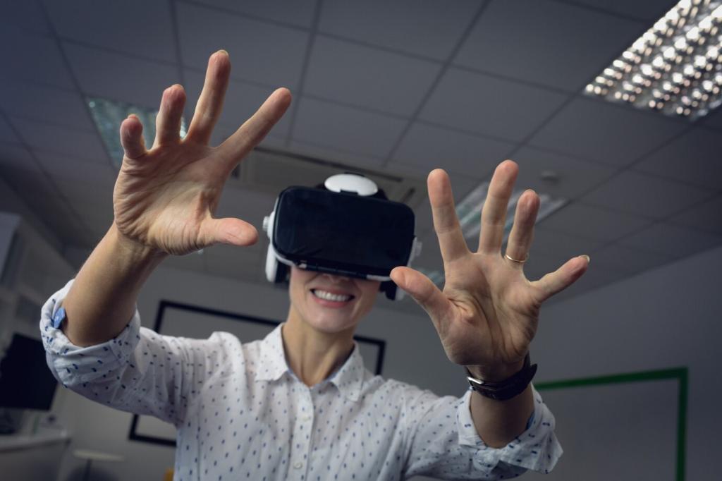
Interaction Affordances You Can See
A reticle should respect depth and surface normals. Slight growth on target, color shift on confirm, and a timed dwell ring reduce guesswork. Calibrate for peripheral clarity. Invite readers to share dwell durations that feel responsive without accidental activation.
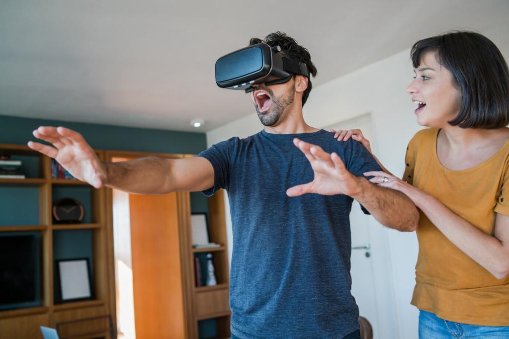
Interaction Affordances You Can See
Represent gestures with subtle trails, glows on pinch, or highlights where grabbing is possible. Controllers benefit from ray visuals that indicate snap points. Provide error states that explain why an action failed. Ask the community which visual echo reduced gesture confusion most in their tests.
Motion, Transitions, and Spatial Storytelling
01
Easing That Feels Physical, Not Floaty
Choose easing based on perceived mass and distance. Objects closer to users should accelerate and settle faster than distant markers. Avoid identical curves for everything. Invite readers to compare cubic bezier presets and report which ones feel most grounded in room-scale experiences.
02
Enter and Exit in the Real World
Spawn objects from logical sources—surfaces, tool docks, or user hands—rather than popping in center frame. Exit by folding into anchors or dissolving into light matching the environment. Ask the audience which entrance patterns preserved immersion during fast task switching.
03
Guided Paths and Visual Breadcrumbs
Use subtle arrows, glow pulses along floor anchors, or waypoint halos to guide without commanding. Keep breadcrumbs consistent in color and rhythm. Allow users to dismiss guidance quickly. Encourage subscribers to share patterns that helped first-time users complete multi-step tasks confidently.
Stories from the Field: Testing Visual Elements in AR
The Day Shadows Saved a Demo
During a museum pilot, visitors ignored a floating ‘Start Tour’ orb until we added a small, soft contact shadow. Engagement jumped immediately, and staff stopped pointing it out manually. The smallest visual tether changed behavior more than copy edits and button color tests combined.
Legibility Lost in Sunlight
A field maintenance tool looked crisp indoors, but outdoors the labels vanished. Adding adaptive backplates with auto opacity and slightly heavier type solved it. We learned to set minimum angular size thresholds and log luminance so designers could correlate complaints with real lighting conditions.
Occlusion Builds Trust, Even When Imperfect
Construction workers trusted overlays more when beams occluded holographic pipes, despite occasional mesh artifacts. A soft edge mask plus a visible ‘tracking improving’ hint preserved confidence. The lesson: imperfect realism with honest feedback beats crisp visuals that ignore physical constraints.